
Smart Calendar
improving scheduling for wholesalers

Overview
I was the lead designer for a client's Salesforce-based iOS app that external wholesalers use to sell funds to financial advisors. I've included some of the work for Smart Calendar, a new feature to help the wholesalers quickly see their availability and schedule meetings with nearby advisors.
This is a proprietary app, so I cannot disclose the client or other features that I'm working on.
TOOLS
Sketch, Figma
Skills
enterprise UX design, design systems, adaptive design
time
winter 2023, fall 2024
Solution
A "smart calendar" that provides a contextual view of the schedule and surfaces essential information.
Problem
Wholesalers can't easily schedule new meetings, view meeting details, or compare calendars while on the road.
Background
Process
I took the existing design system for the app and updated it to meet the new business and technical requirements given by the product managers. This included integrating more iOS UI to create a familiar experience across this app and native iOS apps.
I collaborated regularly with the users, product managers, and engineers to ensure this design met the requirements and would be feasible to implement.
PRIMARY USERS + need
This app is used by wholesalers who sell mutual funds to financial advisors. They are always on the go, and their success heavily relies on meeting with as many advisors as possible. However, they only have a few minutes between meetings to review their schedule and book new visits.
The current experience makes it difficult to view their open availability and zone schedule.
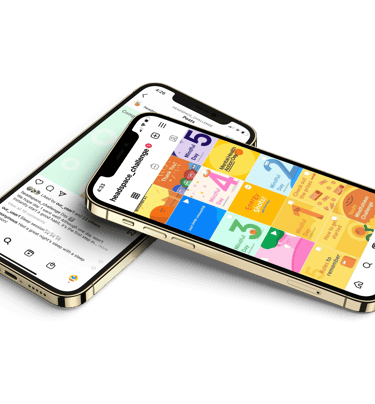
old calendar view
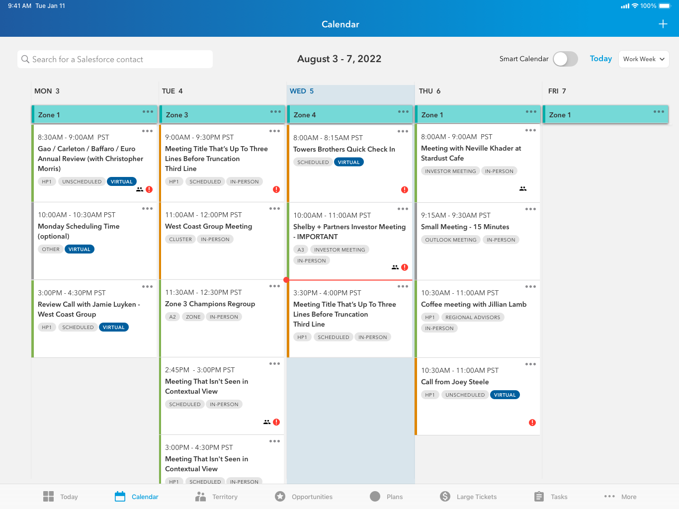
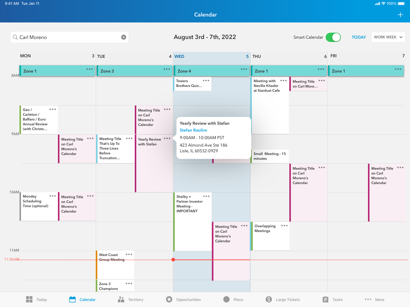
Smart Calendar
Design Requirements
Smart Calendar is an approach that allows users to find open times to schedule meetings with advisors that are in the same geographic area as other scheduled meetings. The major new requirements are:
Clean up the compressed stacked view
Create a contextual view (aka "Smart Calendar") so that users can see open times in their calendars
Indicate daily zones
Enable users to easily compare calendars with another wholesaler
Display important meeting details, like advisor priority level and type of meeting
Allow users to quickly find other advisors in the same area of a given meeting
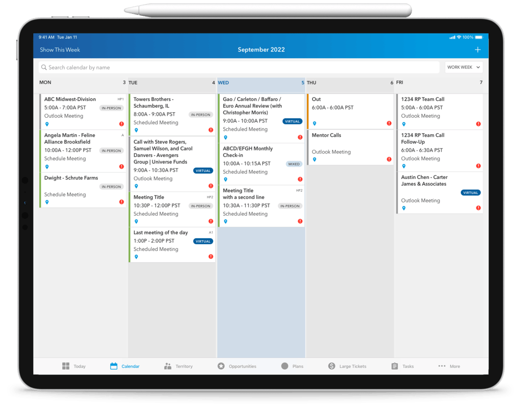
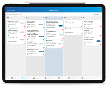
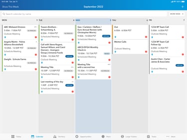
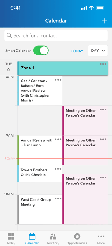
Stacked View
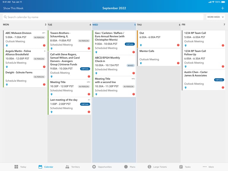
BEFORE
AFTER
Changes
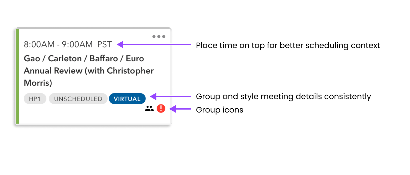
Clean up meeting detail icons and badges
Display zones
Indicate a shared meeting
Indicate current time

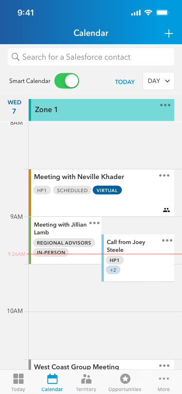
Contextual View
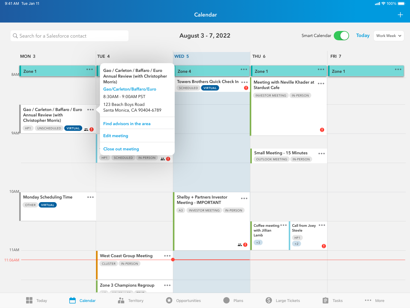
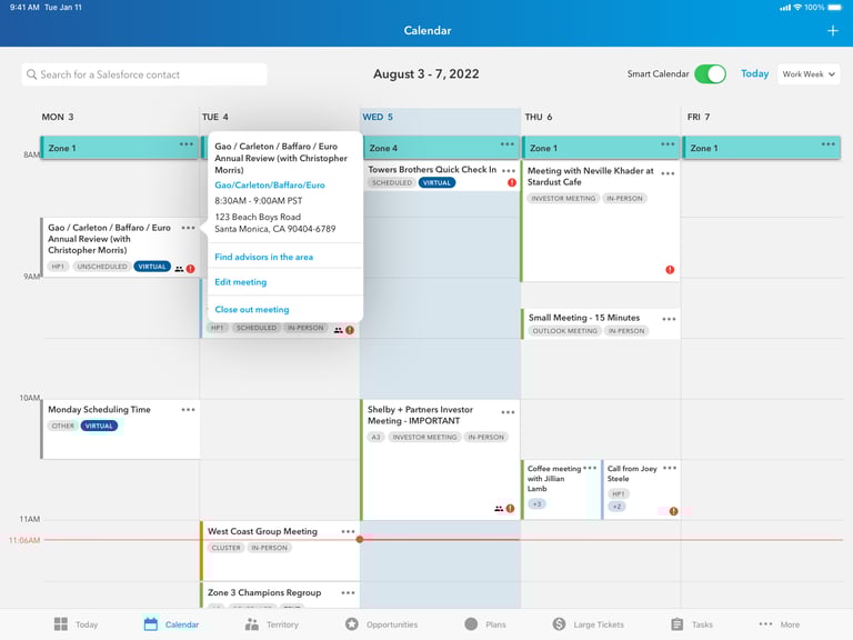
NEW VIEW

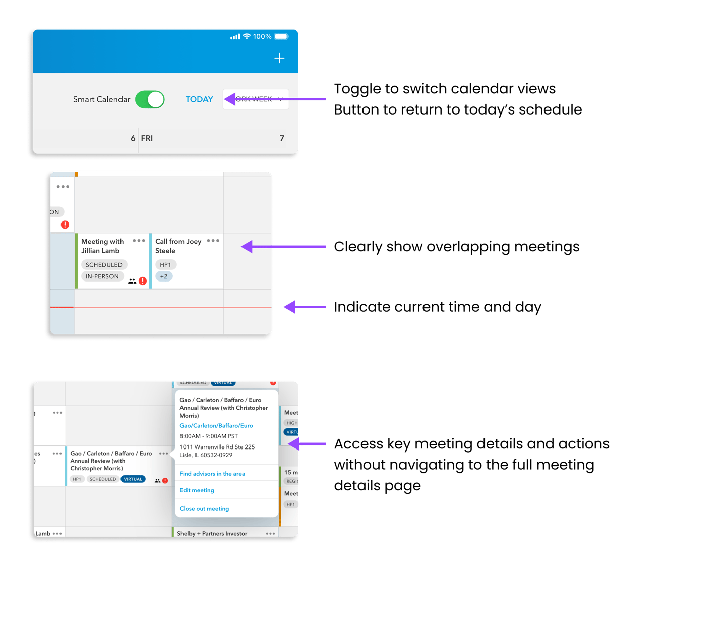
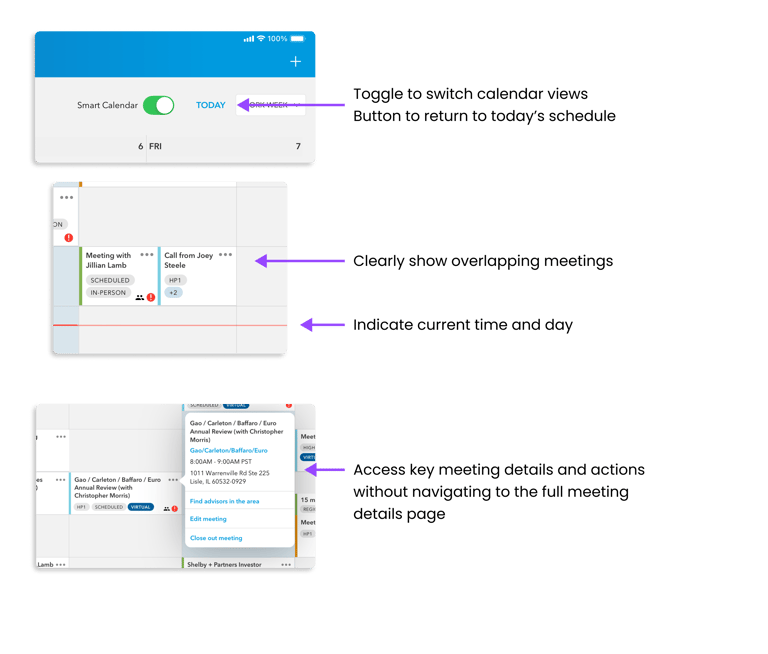
New Features
Toggle between contextual and stacked view
Show empty times in the schedule
Meeting summary popover to quickly review key details without navigating away from the page
Indicate current time
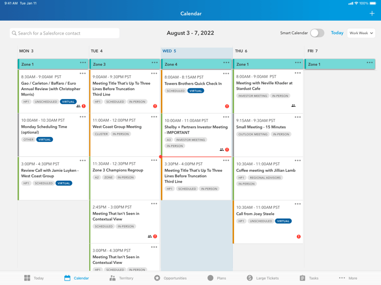
Compare Calendars
Changes
Leverage the new contextual view so that users can see calendars side by side
Simplify meeting cards and display details without clicking into the meeting details page
See the entire work week
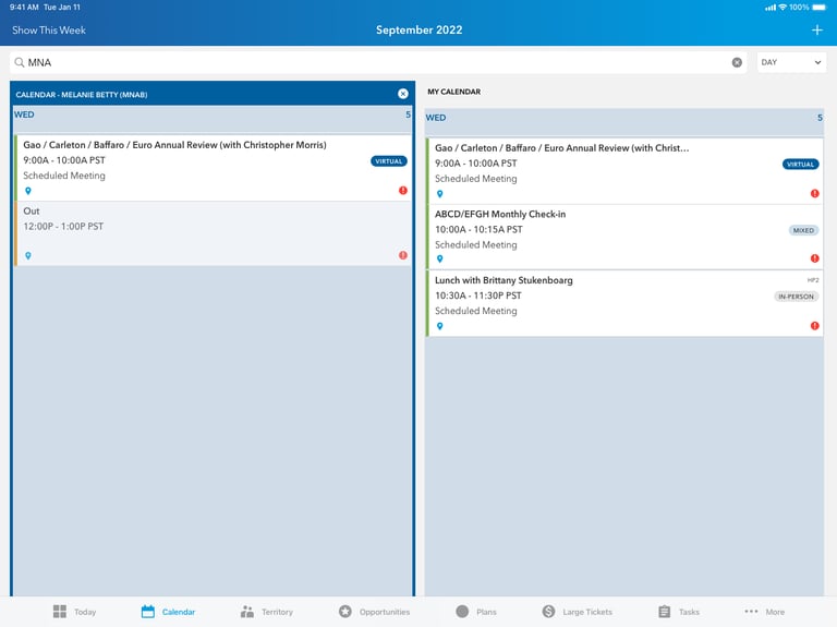
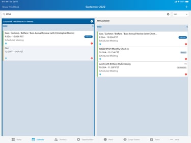
BEFORE
AFTER


Month View
New Features
Month view so the user can see where they'll be each day
Focus on zones
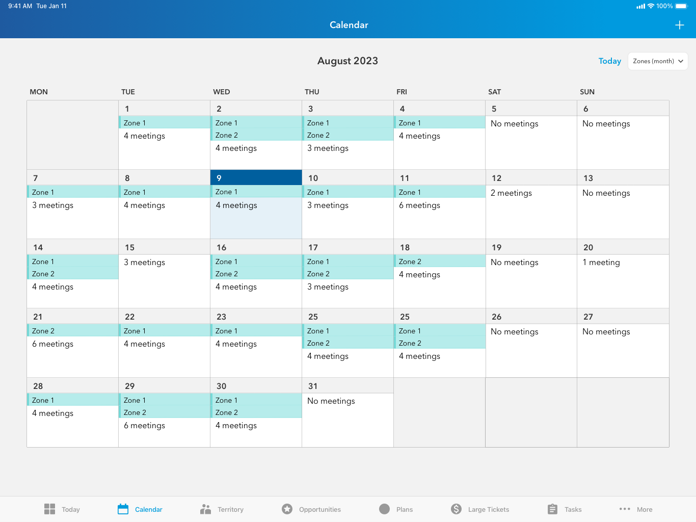

NEW VIEW
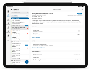
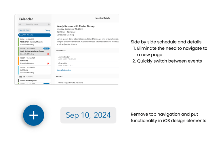
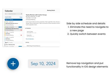
North Star
Although the Smart Calendar meets the business and technical requirements, it's still far from how other iOS apps work. One of the team's long-term goals is to integrate more Apple design patterns and reduce the number of pages in the app.
I conducted a thorough investigation of Apple UX and visual design patterns, as well as of how other organizations display calendars and data-heavy pages. I created a prototype to demonstrate the ideal calendar view we can work towards.

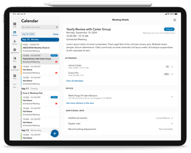
Features
View the schedule and meeting details side by side
Integrate existing Apple HCI patterns like layout, calendar components, ornaments, and buttons
Free up real estate by reconfiguring the navigation bars
Reflection
This proprietary app was my first experience with enterprise UX. I shifted my mindset from consumer design to focus on business needs and efficiency. I leveraged my creative problem-solving to rethink how a basic calendar can be customized to meet the specific needs of my users.
Being the only designer on this project pushed me out of my comfort zone. I had to organize a messy design system and Zeplin files, redesign full pages and experiences, collaborate with salespeople with dozens of years more work experience than me, and make executive design decisions. I took on the responsibilities of a much more senior designer and gained confidence in my abilities to lead a design project.